|
|
Complaint to Ofcom Regarding “The Great Global Warming Swindle”2. Complete Transcript and Rebuttal |
|
|
|
|
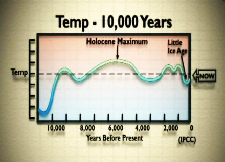
[Comment 39: Cut to graph showing the temperature over the past 10,000 years: Like the previous graph (Comment 37, page 29), this is a “schematic diagram”, not a plot of real data, from the 1990 IPCC report (Fig 7.1(b), p202, see http://tinyurl.com/ypvurw). The dashed line actually represents temperatures at the beginning of the 20th century, and the graph ends before the large warming of the past century, so the “Now” label is highly misleading. In terms of the global average, Holocene Maximum temperatures are not known very well, but best estimates suggest they were no warmer than now and only 0.5 °C warmer than in the mid-20th century, although there are considerable uncertainties (see Wikipedia: http://tinyurl.com/3bj7tj). Thus the programme misleads by asserting facts where there is uncertainty, and where the best guess would be contrary to the programme’s assertion. Also, by showing the above schematic, which was produced in 1990, and was not based on real data, and ignoring all of the quantitative research that has been done since then, the programme makers misled the public about the current state of scientific knowledge. Important context is also missing, in that the warming during the “Holocene Maximum” can be explained by changes in the Earth’s orbit (the Milankovitch cycles: see http://tinyurl.com/hh2ea and http://tinyurl.com/293grf [NOAA – the National Oceanic and Atmospheric Administration]), which also controlled the ice ages, but which are not relevant to the present warming. Continued … |
[Bookmarks on this page:
Click any of the following links to go to that bookmark. You can then copy and paste
the bookmark’s url from your address bar, and send it to someone as a link
straight to that bookmark:
Comment 39: Holocene Maximum /
Graph from the film: World Temp 10,000 Years]
|
|
||
