|
|
Complaint to Ofcom Regarding “The Great Global Warming Swindle”2. Complete Transcript and Rebuttal |
|
|
|
|
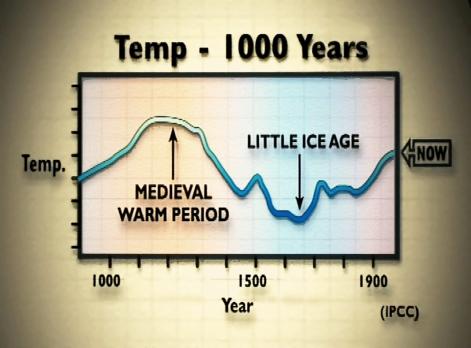
[Comment 37: Cut to the following graph of temperature over the past 1000 years attributed by the programme to “IPCC”: In fact this graph appeared in the 1990 IPCC report (Fig. 7.1(c), p202, see http://tinyurl.com/ypvurw), and was described there as “a schematic diagram”, and not as a plot of real data; and for which the report cautions that “it is still not clear whether all of the fluctuations indicated are truly global.” Most importantly, the above graph covers the period 900 AD to 1975, just before the start of by far the strongest and most sustained period warming in the 20th century. So by marking the end point of the above graph as “Now” rather than “1975” (see above), the programme makers misled the audience. Up to 1990, palaeoclimatic reconstructions of past global temperatures were largely qualitative rather than quantitative; and the documentary did not mention the huge amount of more up-to-date evidence based on the considerable palaeodata that has been obtained and analysed since the 1990 IPCC report was published; data which led the 2001 and 2007 IPCC reports to conclude that recent average Northern Hemisphere temperatures are likely to have been the highest in at least the past 1000 years (in the case of the 2001 report), and in at least the past 1300 years (in the case of the 2007 report). See the 2001 IPCC Third Assessment Report at http://tinyurl.com/32y43n, the 2007 IPCC Summary for Policy Makers at http://tinyurl.com/2xl4c6, and Chapter 6 of the full report at http://tinyurl.com/3dwapw. Continued … |
[Bookmarks on this page:
Click any of the following links to go to that bookmark. You can then copy and paste
the bookmark’s url from your address bar, and send it to someone as a link
straight to that bookmark:
Comment 37: ‘Medieval Warm Period’ /
Graph from the film: Temp 1000 Years]
|
|
||
