|
|
|
Extracts from Ofcom Complaint, by Category Falsification/Manipulation of Graphs |
Table of Contents:
Click any of the following links to go to that bookmark. You can then return the top of the page (e.g. by pressing <Alt> + <Left Arrow> or <Ctrl> + <Home>), and select a different section, thus allowing you to use this list as a Table of Contents:
Comment 37: ‘Medieval Warm Period’ / Graph from the film: Temp 1000 Years / Global Warming Art: Reconstructed Temperature Graph
Comment 39: Holocene Maximum / Graph from the film: World Temp 10,000 Years
Comment 42: 20th Century Cooling / Graph from the film: World Temp 120 Years / Graph from the film: World Temp 110 Years / NASA graph of Global Land Ocean Index / Three graphs comparison
Comment 59: 20th century Sunspot Activity / Graph from film: Temp and Solar Activity 100 Years / Figure 1 from Damon and Laut 2004
Comment 60: Sunspot activity since 1540 / Two graph comparison
Key to colour-coded commentary text
Bright red text: Actual falsification of data, and/or misrepresentation of the views of a contributor to the programme
Dark red text: Narration, or on-screen graphics, or an accumulation of consecutive interviewee statements that taken together amount to narration; which are either factually inaccurate, or apparently intentionally misleading, or are an attempt to give the impression that a contentious opinion is a fact.
Blue text: Interviewee is either factually inaccurate, apparently intentionally misleading, or expresses an opinion as if it were a fact without context being provided to make it clear that it’s an opinion.
|
[Narrator] |
If we look back further in time, before the Little Ice Age, we find a balmy golden era, when temperatures were higher than they are today … |
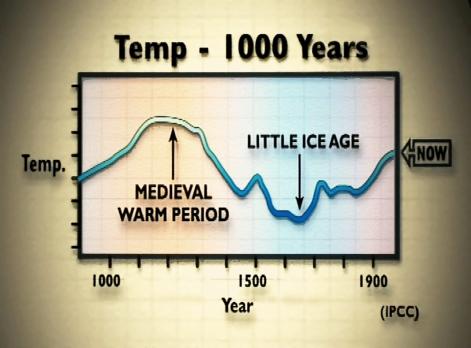
[Comment 37: Cut to the following graph of temperature over the past 1000 years attributed by the programme to “IPCC”:
In fact this graph appeared in the 1990 IPCC report (Fig. 7.1(c), p202, see http://tinyurl.com/ypvurw), and was described there as “a schematic diagram”, and not as a plot of real data; and for which the report cautions that “it is still not clear whether all of the fluctuations indicated are truly global.” Most importantly, the above graph covers the period 900 AD to 1975, just before the start of by far the strongest and most sustained period warming in the 20th century. So by marking the end point of the above graph as “Now” rather than “1975” (see above), the programme makers misled the audience.
Up to 1990, palaeoclimatic reconstructions of past global temperatures were largely qualitative rather than quantitative; and the documentary did not mention the huge amount of more up-to-date evidence based on the considerable palaeodata that has been obtained and analysed since the 1990 IPCC report was published; data which led the 2001 and 2007 IPCC reports to conclude that recent average Northern Hemisphere temperatures are likely to have been the highest in at least the past 1000 years (in the case of the 2001 report), and in at least the past 1300 years (in the case of the 2007 report). See the 2001 IPCC Third Assessment Report at http://tinyurl.com/32y43n, the 2007 IPCC Summary for Policy Makers at http://tinyurl.com/2xl4c6, and Chapter 6 of the full report at http://tinyurl.com/3dwapw.
See also the recent Juckes et al 2006 paper Millennial temperature reconstruction intercomparison and evaluation at: http://tinyurl.com/32guez (PDF) which reviewed all of the recent literature on palaeoclimatic reconstructions of the temperature history of the last millennium, and which states in its conclusion:
The IPCC2001 conclusion that temperatures of the past millennium are unlikely to have been as warm, at any time prior to the 20th century, as the last decades of the 20th century is supported by subsequent research and by the results obtained here. Papers which claim to refute the IPCC2001 conclusion on the climate of the past millennium have been reviewed and some are found to contain serious flaws. Our study corroborates the IPCC2001 conclusions.
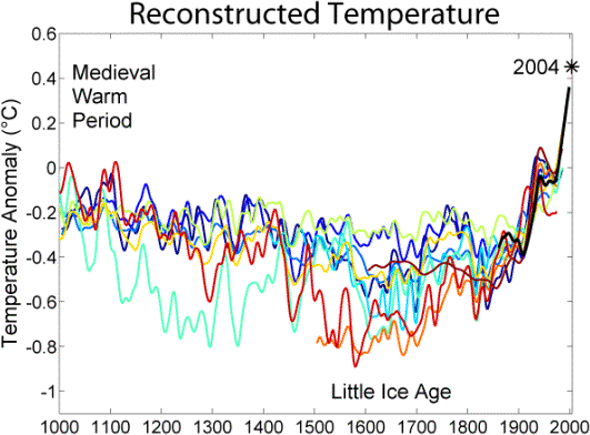
Compare the graph used in the programme with the following graph from the Global Warming Art website at: http://tinyurl.com/2ugjbm, which superimposes the results of 10 peer-reviewed studies by separate groups of climate scientists, carried out between 1998 and 2005, of temperatures over the past 1000 years. Although each of the temperature reconstructions below are different, due to the differing calibration methods and data used, they all clearly show that late 20th century temperatures to have been the highest in that 1000 year period:
Thus by showing a graph that was a schematic and was not based on data, produced in 1990 when quantitative palaeoclimatology based on real data was in its infancy; and by ignoring all of the peer reviewed research that has been done since then, the programme makers misled the public about the science of the reconstruction of past climate.]
(In breach of the 2003 Communications Act Section 265, Ofcom 5.4, 5.5, 5.7, 5.11, 5.12)
|
[Narrator] |
Going back in time further still, before the Medieval Warm Period, we find more warm spells, including a very prolonged period during the bronze age known to geologists as the Holocene Maximum, when temperatures were significantly higher than they are now for more than 3 millennia. |
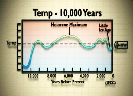
[Comment 39: Cut to graph showing the temperature over the past 10,000 years:
Like the previous graph (Comment 37, page 29), this is a “schematic diagram”, not a plot of real data, from the 1990 IPCC report (Fig 7.1(b), p202, see http://tinyurl.com/ypvurw). The dashed line actually represents temperatures at the beginning of the 20th century, and the graph ends before the large warming of the past century, so the “Now” label is highly misleading.
In terms of the global average, Holocene Maximum temperatures are not known very well, but best estimates suggest they were no warmer than now and only 0.5 °C warmer than in the mid-20th century, although there are considerable uncertainties (see Wikipedia: http://tinyurl.com/3bj7tj). Thus the programme misleads by asserting facts where there is uncertainty, and where the best guess would be contrary to the programme’s assertion. Also, by showing the above schematic, which was produced in 1990, and was not based on real data, and ignoring all of the quantitative research that has been done since then, the programme makers misled the public about the current state of scientific knowledge.
Important context is also missing, in that the warming during the “Holocene Maximum” can be explained by changes in the Earth’s orbit (the Milankovitch cycles: see http://tinyurl.com/hh2ea and http://tinyurl.com/293grf [NOAA – the National Oceanic and Atmospheric Administration]), which also controlled the ice ages, but which are not relevant to the present warming.
Using the “significantly” warmer Holocene Maximum period to suggest that we should not be concerned with warming also neglects the fact that the ecosystems and economies of today are not the same as those of 7–8000 years ago: the global population is much larger and societies live in built-up environments. For an assessment of how future warming is likely to impact economies and ecosystems during the 21st century, see the IPCC Third Assessment Report on Impacts, Adaptation and Vulnerability at http://tinyurl.com/hu7dr.]
(In breach of the 2003 Communications Act Section 265, Ofcom 5.4, 5.5, 5.7, 5.11, 5.12)
|
[Narrator] |
Industrial production in the early decades of the 20th century was still in its infancy – restricted to only a few countries, handicapped by war and economic depression. After the Second World War, things changed. Consumer goods like refrigerators and washing machines and TVs and cars began to be mass-produced for an international market. Historians call this global explosion of industrial activity the post-war economic boom. So how does the industrial story compare with the temperature record? |
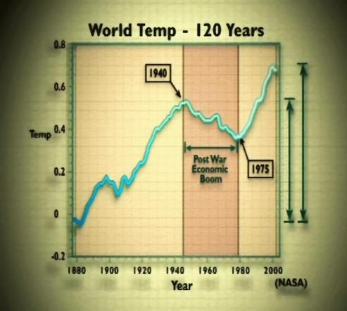
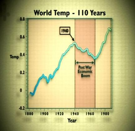
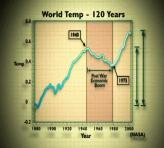
[Comment 42: At this point, the original transmission (on Channel 4, 8 March, 2007) showed the following graph of world temperatures, which it attributed to “NASA”, with a time axis running from around 1875 to 2005, and two arrows to illustrate the claim that “most of the rise in temperature [since the mid-19th century] occurred before 1940”:
An investigation by The Independent newspaper (see http://tinyurl.com/2wrm7u) revealed that the graph used by the Channel 4 programme was taken directly from a non-peer-reviewed paper by Arthur Robinson and Zachary Robinson of the Oregon Institute of Science and Medicine (see page 154 [of the full complaint]), with co-authors Sallie Baliunas and Dr Willie Soon (see page 138 [of the full complaint]) of the George C. Marshall Institute (see page 149 [of the full complaint]).
The graph it was based on was Figure 12 of the paper, Environmental Effects of Increased Atmospheric Carbon Dioxide, which is at http://tinyurl.com/28gzs3. [Note: When this complaint was submitted, we linked to http://tinyurl.com/2ca6q. However that web page now loads a new version of the paper in question, that has been completely rewritten since our complaint was submitted. The current link is to an archived copy in PDF format of the paper as it was on 21 March 2007.] This paper, which concluded that “industrial activities can be counted on to encourage greater species biodiversity and a greener planet”, had formed part of the heavily-criticized “Oregon Petition”, a bulk mailing to thousands of scientists to petition against the Kyoto Protocol (see Science magazine: http://tinyurl.com/2s2rho, and the Center for Media and Democracy: http://tinyurl.com/qxxcq).
However, the original Robinson et al graph ended in the mid-1980s. The documentary re-labelled the time axis to give the incorrect impression that the graph extended to the present day, thus leaving out the past 20 years of unprecedented global warming while apparently intentionally deceiving viewers into thinking that this period had been included.
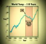
In the repeat (shown on More 4, March 12, 2007) the time axis had been corrected, and the arrows and attribution to NASA removed, although no other attribution was given:
However, the graph remained highly misleading, since it still did not show the temperature rise over the past 20 years, despite the unchanged and false narration claiming that “most of the rise [in temperature in the 20th century] occurred before 1940”, and despite the narration continuing to claim that there had been 40 years of cooling, when even its own revised graph only showed 25 years of cooling.
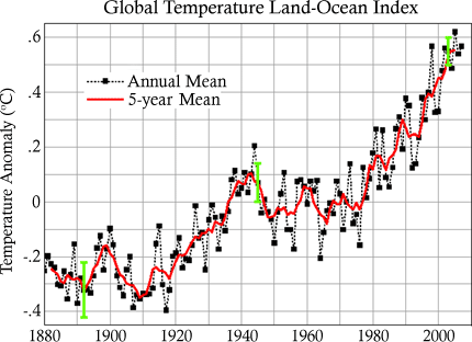
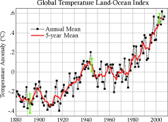
In fact, the real NASA data is readily available on NASA’s own website at http://tinyurl.com/2fq44q and is shown below:
The NASA graph directly contradicts the programme’s assertion that “most of the rise … occurred before 1940”. It also shows that the extent of the mid-century cooling is greatly exaggerated in both of the graphs shown in the documentary. Finally, the claim made by the narrator that the temperature fell for four decades is only supported by the earlier, falsified graph, and is contradicted both by the corrected graph and by the NASA data. The conclusions stated in the documentary about temperatures in the 20th century are thus based on incomplete, old and apparently intentionally falsified data, and were used to mislead the public regarding the status of current scientific knowledge.
For comparison purposes, here are the three graphs alongside each other:
|
|
|
] |
|
Graph broadcast 08 Mar, 2007 |
Graph broadcast 12 Mar, 2007 |
The accurate graph on NASA’s website |
(In breach of the 2003 Communications Act Section 265, Ofcom 5.4, 5.5, 5.7)
|
[Narrator] |
In 1991, senior scientists at the Danish Meteorological Institute decided to compile a record of sunspots in the 20th century and compare it with the temperature record. |
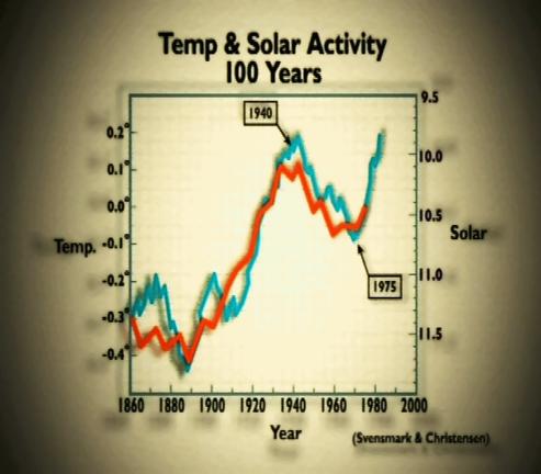
[Comment 59: A graph is shown plotting temperature (blue line) against “solar” (red line):
Although the graph is attributed by the Channel 4 programme to “Svensmark and Christensen” it was first published in a paper by Friis-Christensen and Lassen, Science 254, 698 (1991), see http://tinyurl.com/39dyse.
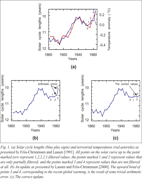
The number of sunspots change in a cyclical way over a time period of about 11 years, but this “solar cycle length” varies from cycle to cycle. The documentary reports that Friis-Christensen and Lassen found a good correlation between solar cycle length and temperature. However, the documentary does not mention that after corrections and updates to their original paper the correlation after 1975 disappeared (see for instance Kristjánsson, 2001, http://tinyurl.com/yvc8zu, PDF); with the temperature rapidly increasing while the solar curve remains flat. The solar (red) line in the documentary ends in 1975 before this break-down in the correlation began, presenting a deeply misleading picture.
These later corrections in the scientific literature are summarized by Damon and Laut in a paper in EOS, Transactions American Geophysical Union, 2004 (abstract at http://tinyurl.com/2m5jwk, full version at: http://tinyurl.com/q7wg5, PDF). Damon and Laut summarise the findings of a number of peer reviewed papers, which show:
… that the apparent strong correlations displayed on these graphs have been obtained by incorrect handling of the physical data. The graphs are still widely referred to in the literature, and their misleading character has not yet been generally recognized.
Below, we show Damon and Laut’s comparison of (a) the original Friis-Christensen and Lassen data from 1991 which was used in the documentary, (b) an updated version of the solar data from 2000, and (c) the corrected data. As a result of the correction, the apparent correlation between sunspot cycle length and terrestrial temperature disappears after 1960. This was not identified by the film makers.
In 2000, Lassen and Friis-Christensen replied to an earlier paper co-authored by Laut, and defended their earlier findings, reiterating that they considered the correlation to have been significant between 1570 and 1970, and making clear that this did not exclude any other climate forcing agents, “including the effect of man-made greenhouse gases, in particular, after 1970.” (http://tinyurl.com/39hka9). Thus Friis-Christensen and Lassen have themselves specifically stated that the correlation only exists up to 1970. This point, which would have vastly changed the message presented by the Channel 4 programme, was omitted, and in omitting it, the public have been greatly misled.
On April 27, 2007 Friis-Christensen issued a joint statement with one of the lead authors of this complaint, Nathan Rive, stating specifically that Friis-Christensen’s views had been seriously misrepresented by the Channel 4 programme – see Comment 60 below.]
(In breach of the 2003 Communications Act Section 265, Ofcom 5.4, 5.5, 5.7, 7.2, 7.3, 7.6, 7.9)
|
[Narrator] |
What they found was an incredibly close correlation between what the sun was doing and changes in temperature on earth. Solar activity, they found, rose sharply to 1940, fell back for four decades until the 1970s, and then rose again after that. |
|
[Dr Eigil Friis-Christensen, Director, Danish National Space Centre] |
When we saw this correlation between temperature and solar activity or sunspot cyclings, then people said to us: “okay it can be just a coincidence.” So how can we prove that it’s not just a coincidence? Well one obvious thing is to have a longer time series, or a different time series. Then we went back in time. |
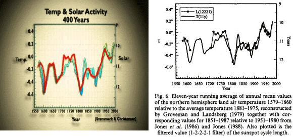
[Comment 60: Cut to a graph comparing temperature and solar cycle length since 1540, which is (mostly) taken from Friis-Christensen and Lassen, J . Atmos. Terr. Phys. 57, 835 (1995). As with their 1991 paper, the documentary fails to mention that the paper’s results have been strongly disputed in the scientific literature (see Peter Laut, 2003, http://tinyurl.com/2ule4h, PDF, and Damon and Laut, 2004, http://tinyurl.com/2cwntm, PDF).
But much more importantly, the original graph has been falsified by the film makers. The original Lassen and Friis-Christensen graph shows a gap in the sunspot cycle length curve (line dotted with circles) for the period 1600 to 1700. This is because this period was the Maunder Minimum (http://tinyurl.com/p479h), a period when there were few sunspots. It’s not possible to measure the sunspot cycle length when there are no sunspots. The documentary makers presented a graph, however, where this gap had been filled with the temperature data, giving the impression of perfect correlation during this period. Here are the two graphs side by side:
On April 27, 2007 Friis-Christensen issued a joint statement with one of the lead authors of this complaint Nathan Rive (see http://tinyurl.com/yvmatf), which states:
We have concerns regarding the use of a graph featured in the documentary titled ‘Temp & Solar Activity 400 Years’. Firstly, we have reason to believe that parts of the graph were made up of fabricated data that were presented as genuine. The inclusion of the artificial data is both misleading and pointless. Secondly, although the narrator commentary during the presentation of the graph is consistent with the conclusions of the paper from which the figure originates, it incorrectly rules out a contribution by anthropogenic greenhouse gasses to 20th century global warming.
Rive and Friis-Christensen go on to state:
The audience is told that the L+FC results demonstrate (a) the sun drove temperature changes over the past 400 years, and (b) no other agents were involved in changing the climate in that time. This is an overstatement that is not supported by the graph, interview statements by Friis-Christensen in the program, nor any related scientific literature. Although solar variations seem to be a major cause of climate variations on centennial and millennial time scales in the pre-industrial era (see for example Bond et al.,2001 [Science, 294: 2130-6]), there are certainly other natural sources of climate change. For the industrialised period, the L+FC (and other) results do not exclude an effect from man-made greenhouse gases.
Thus Friis-Christensen has stated quite clearly and publicly that not only was his published data falsified by the film-maker, but that his views were knowingly and fundamentally misrepresented by the film.]
(In breach of the 2003 Communications Act Section 265, Ofcom 5.7, 7.2, 7.3, 7.6, 7.9)
