|
|
- Table of Contents

- Printing options

Accessibility |
Table of Contents:
Click any of the following links to go to that bookmark (or heading). You can then return the top of the page (e.g. by pressing <Alt> + <Left Arrow> or <Ctrl> + <Home>), and select a different section, thus allowing you to use this list as a Table of Contents:
1. Summary / 2. The Drop-down Menus / 2.1 Keyboard Accessibility / 2.2 Using the Menus When JavaScript is Disabled / 2.3 Using the Menus on a 640x480 Screen and at Large Zoom Levels / 3. External Links / 4. Pop-up Notes / 4.1 The Table of Contents Pop-ups Are Optimised for Viewing at 640x480 and at Large Zoom Levels / 5. Alternative Stylesheets / 5.1 Why the CSS “Pseudo-frames” are Not Loaded if one has JavaScript Disabled / 6. Typography and Readability / 6.1 Font Sizes / 6.2 Characters per Line / 6.3 Line spacing / 6.4 Inter-paragraph spacing / 6.5 General Typography / 6.6 Minimalist Design / 6.7 Reduced Contrast / 7. The Use of Pixels to Define Measurements on this Site / 7.1 Font Sizes / 7.2 The Width of the Simulated “Document Page” / 8. “Alt” Text, and the <Strong> and <Em> Tags / 9. Heading Levels Conform to Web Accessibility Initiative Guidelines / 10. Standards Compliance / 11. Note Regarding Safari / 12. Final Note
1. |
Summary
A great deal of work has gone into making this website accessible to the widest possible readership. The key points are as follows:
|
||||||||||||||||||||||||
2. |
The Drop-down MenusThe main menu items that have a drop-down sub-menu associated with them have a down-arrow next to them to indicate this, whereas on the sub-menus, items that have a sub-sub-menu associated with them have a right-arrow next to them. The menu system is up to three levels of sub-menu deep, and is in effect also a complete site map. |
||||||||||||||||||||||||
2.1 |
Keyboard AccessibilityIn most browsers, when JavaScript is enabled, the drop-down menus on this site can be operated by tabbing to the relevant main menu item and then pressing <Enter>. One can then navigate the entire menu structure using the arrow keys on one’s keyboard. In order to go to a page that the menu links to, press <Enter> again. To dismiss the drop-down menus using the keyboard, after you’ve invoked them, you can press the left or right arrow keys on your keyboard until the focus is on a main menu item that does not have a drop-down menu associated with it (i.e. the “Search” and “Home” menu items). Unfortunately the keyboard accessibility feature does not work in Safari or Opera; and it also doesn’t work if JavaScript is disabled. However, you can still use the menus when JavaScript is disabled, and they can then be navigated with the keyboard (see section 2.2 below) – so Opera and Safari users who need to be able to navigate exclusively with the keyboard should disable JavaScript when using this website. |
||||||||||||||||||||||||
2.2 |
Using the Menus When JavaScript is DisabledUnlike the drop-down menus on most sites, those on this site are fully functional in most browsers when JavaScript is disabled. When JavaScript is enabled, one has to click on the main menu items in order to invoke the drop-down sub-menus associated with them (so that they won’t appear unexpectedly when you don’t want them to). However, when JavaScript is disabled, the drop-down menus are invoked if you simply hover over a main menu item with your mouse. The drop-down menus don’t drop down in IE5 or 6 when JavaScript is disabled, and although they do drop down in IE7, IE7 has some bugs that make some of the sub-menus hard to read when JavaScript is disabled. Partly for this reason, and partly in order to allow the menus to be accessible to keyboard-only users who have JavaScript disabled, if you click on a main menu item that has a sub-menu associated with it, when JavaScript is disabled, you are taken to a site-map–like page listing all of the sub-menu items (and any sub-sub-menu items) for that main menu item, as a list of links. So one way or another, the menus are fully accessible for everyone when JavaScript is disabled. |
||||||||||||||||||||||||
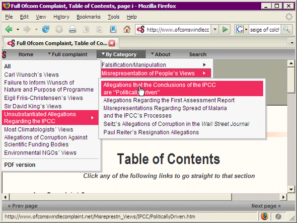
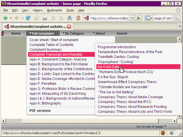
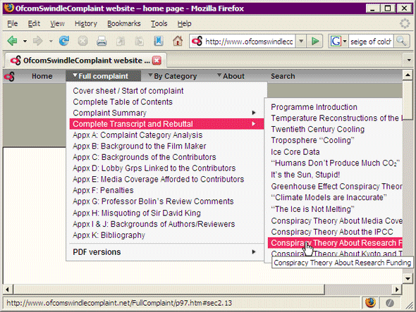
2.3 |
Using the Menus on a 640x480 Screen and at Large Zoom LevelsThe menus have been designed so as to be fully accessible on a 640x48 screen and at large zoom levels. Mostly this has been achieved by making some of the sub-menus left-sided and relatively narrow, as in the following screen capture:
In addition, when JavaScript is enabled, some sub-menus that would otherwise go off the edge of the screen at 640x480 resolution are automatically kept within the window, as in the following screen capture:
When JavaScript is disabled, the text in some of the sub-menus does go off the edge of the screen when viewed at 640x480 resolution, so tooltips have been used to ensure that this text is still readable, as in the following screen capture:
|
||||||||||||||||||||||||
3. |
External LinksMost of the external links on this website are really inline footnotes that link to reference sources that support the statement being made. Rather than using conventional footnotes containing links to references sources as most scientific articles do, this site uses tinyurl web addresses embedded within the article. This is both more user-friendly than using conventional footnotes and more printer-friendly than using the long form web address. There is a web service based at http://tinyurl.com that allows one to type or paste any long url into a text box and press a button, and it will create a very short “alias” url starting with the prefix http://tinyurl.com/ followed by some letters and numbers; and if one then uses the short url that it creates in place of the long one, one will automatically be redirected to the original, long url. As well as making the webpages and PDF files more readable, using shorthand (tinyurl) web addresses in this way also means that if one is reading a printed copy of a document, and needs to type a web address into one’s address bar (as opposed to being able to click on a link when reading on screen) then one will have a much shorter url to type. The only downside to this is that the Web Accessibility Initiative’s Guidelines state that the display text of links should always be meaningful. However the reason for this guideline is that people using keyboard navigation tend to tab though the links on a web page in order to find the navigation links on the webpage. In that context, the tinyurl links on the site are meaningful, in that if you encounter one, you can be assured that it is not a navigation link but is akin to an inline footnote. So when tabbing through the links on a page in search of the site navigation, tinyurl links can always be safely ignored. |
||||||||||||||||||||||||
4. |
Pop-up NotesThere are many pop-up notes on this website that appear, if one has JavaScript enabled, when one hovers with the mouse over text highlighted in yellow; or when one hovers over certain graphics. The text in all of these pop-up notes is also accessible if one has JavaScript disabled, and users of screen readers are therefore advised to disable JavaScript while using this website. There are four categories of pop-up note in use:
|
||||||||||||||||||||||||
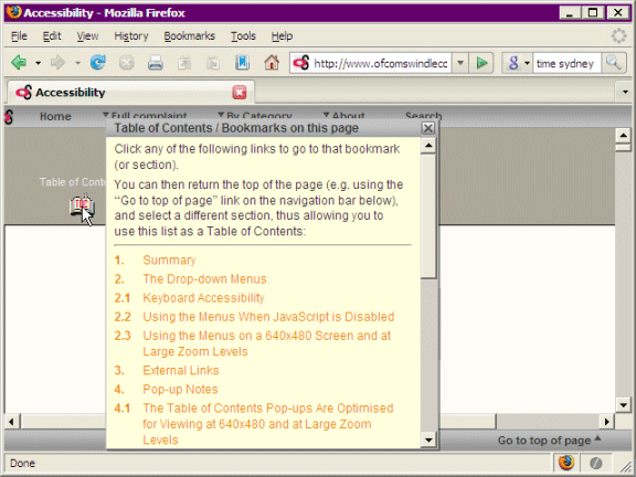
4.1 |
The Table of Contents Pop-ups Are Optimised for Viewing at 640x480 and at Large Zoom LevelsAs mentioned above, single page articles such as this one have a Table of Contents icon at the top of the page, which displays a clickable Table of Contents when you hover over it with JavaScript enabled. On pages where there are a large number of entries in the Table of Contents, a scroll bar is present in order to make it accessible in a 640x480 window, and at large zoom levels – as shown in the following screen capture:
|
||||||||||||||||||||||||
5. |
Alternative StylesheetsIf viewing the site with JavaScript enabled, the navigation bars at the top and bottom of the screen remain visible as one scrolls down the page, so that one doesn’t, for example, have to scroll to the top of the page simply in order to access the menu. This is done using CSS rather than frames, and unlike frames, it is bookmarks-friendly and search engine–friendly. For most users it is anticipated that this feature will greatly enhance this site’s user-friendliness and accessibility; because it means that the menu at the top of the page and the navigation bar at the bottom are always accessible. The latter contains a “Go to top of page” link in single-page articles; while in multi-page articles it contains “Next Page”, “Previous Page” and “Table of Contents” links. Having those links always accessible without having to scroll to them can be a significant time-saver. However, there are some accessibility issues with these “pseudo-frames” that will affect a small proportion of users, so for that reason, if viewing the site with JavaScript disabled these “pseudo frames” are not used, and the menu and navigation bar do not remain visible when one scrolls down the page. (Note for technically-minded readers ») [Note: Although there are two stylesheets, one of which is in use if one has JavaScript enabled and the other if JavaScript is disabled, these haven’t been implemented as “alternative stylesheets” in the W3C sense of the phrase – which means one cannot switch between them other than by switching JavaScript on or off. There are two reasons why it has been implemented in this way:
|
||||||||||||||||||||||||
5.1 |
Why the CSS “Pseudo-frames” are Not Loaded if one has JavaScript DisabledThe accessibility issues with the CSS “pseudo-frames” stylesheet used on this site are as follows:
|
||||||||||||||||||||||||
6. |
Typography and Readability |
||||||||||||||||||||||||
6.1 |
Font SizesThe body text on this site uses a slightly larger default font size than that found on most other websites; and fewer characters per line, both of which enhance readability. In addition, the text in the many pop-up notes on this site that appear (if one has JavaScript enabled) when one hovers over text that is highlighted in yellow; and when one hovers over certain graphics, has a significantly larger font size than the text in standard browser tooltips, in order to make them more readable. |
||||||||||||||||||||||||
6.2 |
Characters per LineIt is generally accepted (see for example http://tinyurl.com/5dz5yu) that for maximum readability, the number of characters per line (CPL) in a single-column document should average within the range 50 to no more than 80; with 65 to 75 CPL being considered by many experts to be the optimum. Full screen line lengths, which are displayed on many websites, are generally considered by readability experts to be difficult (and tiring) to read, especially if reading a long document. (Ironically, the Web Accessibility Guidelines at http://tinyurl.com/578s2u themselves break this rule, as do many other web articles that discuss accessibility.) The average number of characters per line in both the web pages and the PDF files on this website is 66. |
||||||||||||||||||||||||
6.3 |
Line spacingThe body text on this site uses slightly larger line spacing (130% of the font height – the browser default being 120%) than most websites do, which enhances readability. |
||||||||||||||||||||||||
6.4 |
Inter-paragraph spacingThis site follows the typographical rules of context-based inter-paragraph spacing that are widely used in professionally produced printed literature but which, unfortunately, are rarely used on the web. So for example, the gap between the items in a numbered or bulleted list is smaller than that between paragraphs of body text; there is a small gap between a numbered or bulleted list and the paragraph preceding the list; and a much larger gap between the same list and the following paragraph; heading paragraphs have a small space below them and a much larger space above them, with the size of the space above them being larger for major headings than for minor headings; and so on. As well as aiding readability because the inter-paragraph spacing indicates the context of the paragraph, this also creates white space, which also enhances readability by reducing perceived clutter. |
||||||||||||||||||||||||
6.5 |
General TypographyProper typographical symbols (as opposed to their keyboard equivalents) have been used throughout this site for such characters as “quotation marks”, ‘apostrophes’, dashes – and so on. Subscripts and superscripts have been used for chemical formulas such as CO2 and scientific expressions such as W/m2. Internet Explorer Firefox and Netscape display these perfectly, although unfortunately, Safari and Opera do not – they both insert unwanted white space above or below the line containing the expression, so that it looks as if there is a paragraph break in the middle of a paragraph. It is to be hoped this will be remedied in future versions of those browsers. In the meantime, as the vast majority of internet users have either Internet Explorer or Firefox, the appropriate use on this site of subscripts and superscripts will increase readability for most people. In addition, because sans serif quotations marks and apostrophes do not display clearly at screen resolution, these symbols have been formatted using a serif font, unlike the surrounding text, which is formatted for screen display using sans serif fonts. (Printouts of the web pages on this site are formatted differently – see section 2.4 of the article: Printing Web Pages on this Website for details). |
||||||||||||||||||||||||
6.6 |
Minimalist DesignThe design of this website is intentionally minimalist, allowing one’s eye to focus on the content one is reading rather than on the website’s design. |
||||||||||||||||||||||||
6.7 |
Reduced ContrastWhen reading on screen, pure black text on a pure white background results in screen glare, and is tiring to read. For this reason, the text is not quite black (it uses the hex code #333); and the background colour of the simulated “document page” is off-white rather than white (it uses the hex code #fffbf5). This subtly reduces the contrast and makes reading on screen a less stressful experience. |
||||||||||||||||||||||||
7. |
The Use of Pixels to Define Measurements on this SiteThe screen media stylesheets used on this site define most sizes, including all font sizes, in pixels; whereas the print media stylesheets define measurements in points or inches. There are a number of reasons for using pixels, rather than the more widely used ems or percentages, for defining distances on screen: the main ones being that it is the only way of ensuring that a web page will look the same in all browsers; and that because graphics’ sizes are necessarily defined in pixels, if graphics form part of the layout of a page (as they do on many pages on this site), then it makes sense to define all distances and font sizes in pixels for consistency. |
||||||||||||||||||||||||
7.1 |
Font SizesOne reason frequently given, in articles on the subject, for not using pixels to define font sizes is that if font sizes are defined in pixels, Internet Explorer doesn’t allow its users to change the text size. However:
|
||||||||||||||||||||||||
7.2 |
The Width of the Simulated “Document Page”The width of the simulated “document page” has also been defined in pixels, for the reason mentioned above, that the width of graphics must necessarily be defined in pixels, so if graphics are used on a website, it makes sense for the width of everything else to be defined in pixels as well. This does mean that if one alters the text size (as opposed to zooming), the width of the “document page” remains unaltered, but:
Incidentally, although the existence of some serious bugs in IE7’s zoom feature have been mentioned in sections 3.1 and 6.1, it should be noted that one aspect of IE7’s zooming (and of IE8’s zooming, which appears to be bug-free) is greatly superior to Opera’s; and that is its scaling of graphics. Internet Explorer can scale graphics to nearly double their original size without a major decrease in image quality, whereas in Opera, the image quality decreases dramatically even if one zooms in by the minimum amount. One hopes this will be addressed in future versions of Opera (and in Firefox 3), as it is a fairly serious accessibility issue. |
||||||||||||||||||||||||
8. |
“Alt” Text, and the <Strong> and <Em> TagsAll images on this website use meaningful “Alt” text, so that if one has switched off the display of images in one’s browser, the “Alt” text displays in place of the image (unless one is using Safari, which unfortunately does not display “Alt” text, in breach of the Web Accessibility Initiative’s guidelines). In the case of images that serve purely as layout lines and which have no semantic purpose, the “Alt” text consists of a series of underscore characters to indicate that a line is present. With respect to the <strong> and <em> tags, whereas many websites tend to either use <em> and <strong> indiscriminately or to not use them at all, this website uses them appropriately. For example, Internet Explorer is italicised but not emphasised, whereas the following word is emphasised. The idea behind these tags is to allow screen readers to differentiate between text that should be read more loudly or emphatically from text that is bolded or italicised for purely presentational reasons (as in the case of Internet Explorer). Unfortunately, most screen readers simply read the screen and not the underlying code, which means the benefit of using these tags properly is lost; but people who do have a screen reader that supports the <em> and <strong> tags properly will find this web site unusually accessible. |
||||||||||||||||||||||||
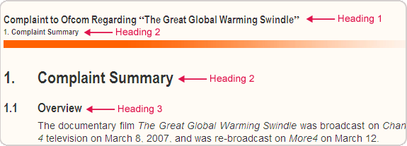
9. |
Heading Levels Conform to the Web Accessibility Initiative GuidelinesThe Web Accessibility Initiative (WAI) guidelines specify that no more than one level 1 heading should ever be used on a single webpage. In order to comply with this, the article title (or header) on each page has been given the style "Heading 1" (or <h1>), and the top level headings (in the conventional sense of the word heading) on each page have been given the style "Heading 2" (or <h2>) rather being given the style "Heading 1" as they normally would be in word-processing or desktop publishing documents. In the case of multi-page articles, where the header on each continuation page contains both the article title and the current chapter title in a small text size, the article title has been given the style <h1> and the chapter title has been given the style <h2>. This means some webpages contain the same "Heading 2" paragraph twice, once in a small text size in the header, and once in the article proper in a larger point size, as in the following screen capture:
|
||||||||||||||||||||||||
10. |
Standards ComplianceAll pages created on this website validate on the W3C’s markup validation service, ensuring compatibility with all standards-compliant web browsers. In addition, the pages on this site display as intended in all versions of Internet Explorer from version 5 upwards, in order to make the site accessible to the widest possible readership. The web pages on this site have also been tested with all the browsers on the browsershots.org website at https://browsershots.org. The only browsers there that don’t display the site properly are Dillo, which has very poor CSS support, and IE4 (although the site is still quite readable in IE4). CSS, rather than html markup, has been used to define attributes throughout.
[Note: if validating the CSS for the web pages on this site, please select “More Options” on the W3C CSS Validation Service web page; and where is says “Profile”, select “CSS Level 3”.] |
||||||||||||||||||||||||
11. |
Note Regarding SafariApple’s Safari browser has a very attractive and user-friendly interface, yet from an accessibility standpoint it is by far the worst of all the major browsers, for reasons discussed in this article and in the article Printing Web Pages on this Website. This is surprising, both because of Apple’s well-deserved reputation for usability, and because of the company’s stated commitment to accessibility at http://tinyurl.com/6q9tmc. One hopes these issues will soon be addressed by them. |
||||||||||||||||||||||||
12. |
Final NoteDo you like this website? If so, you can nominate it for an award. » [Note: An award you might like to nominate this website for: the Plain English Campaign’s Web Award, at http://tinyurl.com/5ch2gk; Other suggestions welcome (via our Contact page). Many thanks! |