|
|
Complaint to Ofcom Regarding “The Great Global Warming Swindle”2. Complete Transcript and Rebuttal |
|
|
|
|
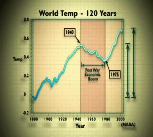
[Comment 42: At this point, the original transmission (on Channel 4, 8 March, 2007) showed the following graph of world temperatures, which it attributed to “NASA”, with a time axis running from around 1875 to 2005, and two arrows to illustrate the claim that “most of the rise in temperature [since the mid-19th century] occurred before 1940”: An investigation by The Independent newspaper (see http://tinyurl.com/2wrm7u) revealed that the graph used by the Channel 4 programme was taken directly from a non-peer-reviewed paper by Arthur Robinson and Zachary Robinson of the Oregon Institute of Science and Medicine (see page 154), with co-authors Sallie Baliunas and Dr Willie Soon (see page 138) of the George C. Marshall Institute (see page 149). Continued … |
[Bookmarks on this page:
Click any of the following links to go to that bookmark. You can then copy and paste
the bookmark’s url from your address bar, and send it to someone as a link
straight to that bookmark:
Comment 42: 20th Century Cooling /
Graph from the film: World Temp 120 Years]
|
|
||
